Dev Log #4 USER-CENTRIC DESIGN
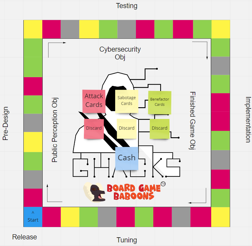
The user-centric design was used to help create the layout of the board. We used the iconic Monopoly board design for this very purpose. I bet even people who have not even played Monopoly now the general gameplay of it due to design and popularity. Just looking at our board will automatically think about the board of monopoly which intern makes the player know what our board is about.
Our board as of right now may not have the artistic design of the board, but we did color our spaces. Our spaces on the board have four colors grey, yellow, red, and green. The player would probably be able to guess what spaces(except yellow) do what without looking at the cards in the middle. This will make the player better memorize the rules of what the spaces do by the color. All the player has to do is just read the rule book get a better understanding of the more in-depth and specific concepts.
I think we make the board very user-friendly. We sectioned the side of the board to indicate the difficulty and the theme. Arrow are points clockwise in case the player does not know which direction to go. There are still things to work on, like art on the spaces and game mechanics, but I believe that what my group has made is user-centeric.

Fake Project for Dev Logs
More posts
- Dev Log#11Apr 04, 2022
- Dev Log #10Mar 22, 2022
- Dev Log #9Mar 15, 2022
- Dev Log #8 - Production, Data, AnalyticFeb 15, 2022
- Dev Log #7 Pre-productionFeb 01, 2022
- Dev Log #6Dec 10, 2021
- Dev Log #5Nov 19, 2021
- Dev Log #3Oct 22, 2021
- Dev Log 2 - Pitching a GameOct 05, 2021
Leave a comment
Log in with itch.io to leave a comment.